
HISTORICAL OVERVIEW
THE CORPORATE IMAGE
“Keep it simple. Make it memorable. Make it visually appealing.”
We like to begin our stories with a quote from someone who, in just a few words, has managed to convey the strategic message that captures a shared idea. A “thank you” to copywriter Leo Burnett, who kicked off our discussion with this aphorism found online. In this chapter, which traces the key milestones in the communication history of Birra Flea, we want to focus on one of the topics that fascinates (and in many cases challenges) an entrepreneur at the start of their journey: brand identity, or more simply, the company’s image and identity.
Partorire un logo da zero è sempre impresa ardua, soprattutto per Matteo e Maria Cristina, fondatori di Birra Flea, che di mestiere si trovavano a fare altro; lui imprenditore di energie rinnovabili, lei tecnico di laboratorio. Per questo venne in aiuto un’altra eccellenza gualdese specializzata nell’illustrazione e nella grafica: Susanna Biscontini. Susanna è un’amica di famiglia e la sua carriera, ad oggi, si compone di quasi venti anni di esperienza nel campo della grafica pubblicitaria. Nata a Gualdo Tadino, inizia il suo percorso a Roma diciotto anni fa, stabilendosi e affinando il proprio bagaglio creativo in importanti agenzie pubblicitarie della Capitale. Questo meraviglioso mondo la porta col tempo ad orientarsi principalmente sull’editoria per l’infanzia, facendo viaggiare la sua mente verso mondi fantastici: “<Segui il coniglio bianco> mi dissi, e come Alice trovavo il Paese delle Meraviglie.” Questa è la frase che la rappresenta!
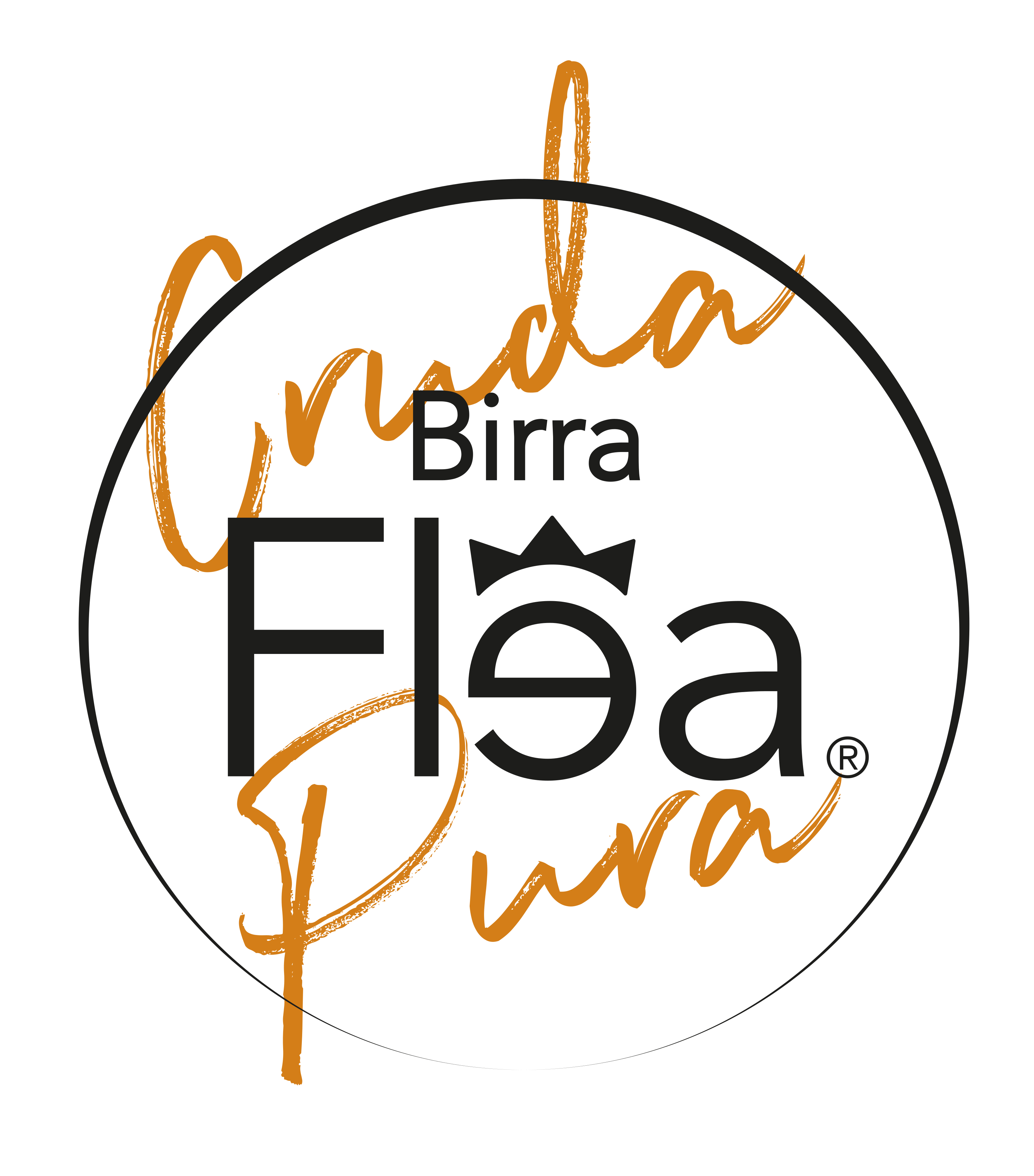
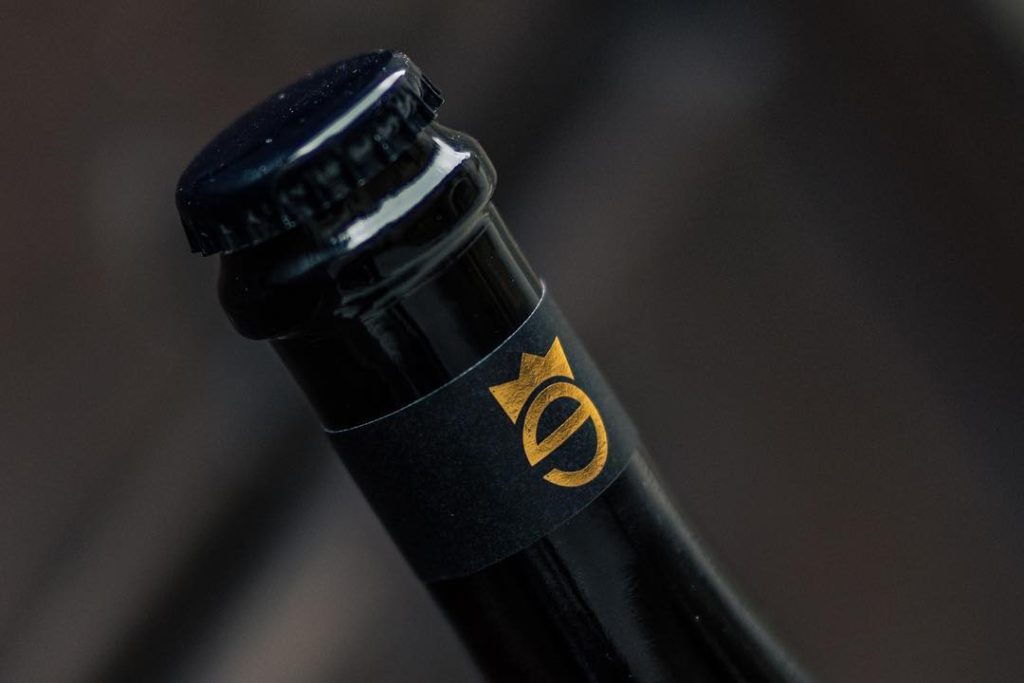
Returning to our story, our collaboration with Susanna began with enthusiasm and immediate openness, right from the very first phone call. Anyone would have embraced such an ambitious project, especially since it was conceived and brought to life in her hometown, Gualdo Tadino. The birth of a production venture in a city where your roots lie means significant opportunities for the local area, but also unquestionable pride on the part of those who envision its image and believe in its expansion across the globe. Thus, in September 2012, the first official correspondence began to name the first beers and solidify the logo concept, which until then had been merely an idea confined within the walls of the Rocca. This marked the start of sketches, proposals, and iconic—sometimes daring—images. Because it is from a daring proposal that the spark ignites. A graphic designer knows that you start with a “whole” and then narrow it down. A designer’s skill lies not in adding but in subtracting, lightening, and synthesizing—ensuring that a logo is immediately recognizable and easy to understand. The Birra Flea logo took shape with that one detail no one expects: not the silhouette of the Rocca, not the classic ear of barley that characterizes much of the beer market, but the crown of Emperor Frederick II. That little crown has now become the icon of our brand, recognized all over the world, tattooed on Matteo’s skin. Yes, our image must have a regal appearance, an elegance that distinguishes our methods and our philosophy.
Having an emperor as the face of our beer, however, calls for a visual setting befitting his rank: we needed a court. Among the various names proposed to identify the different types, we opted for the riskiest but, in a certain sense, the most sensible path: if Frederick II built the Rocca Flea and lent his crown for the logo, who better than him could represent the first beer produced? Thus was born the Golden Ale, which, ladies and gentlemen, was christened Frederick II. From that moment on, thanks to historian Prof. Michele Storelli, we began to delve into the ancient history of Gualdo to complete and name the court.
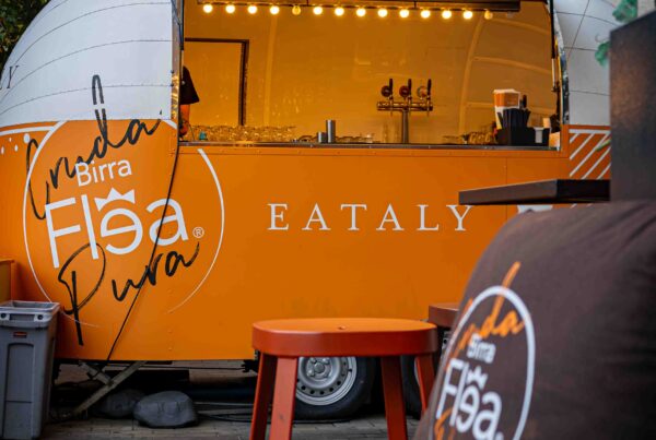
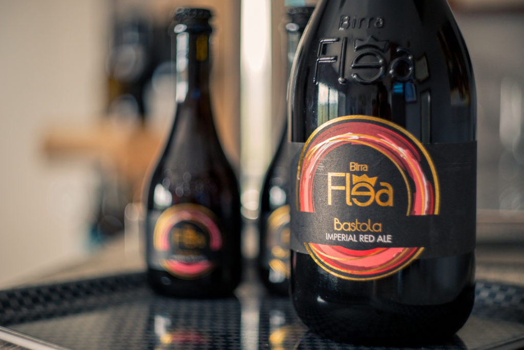
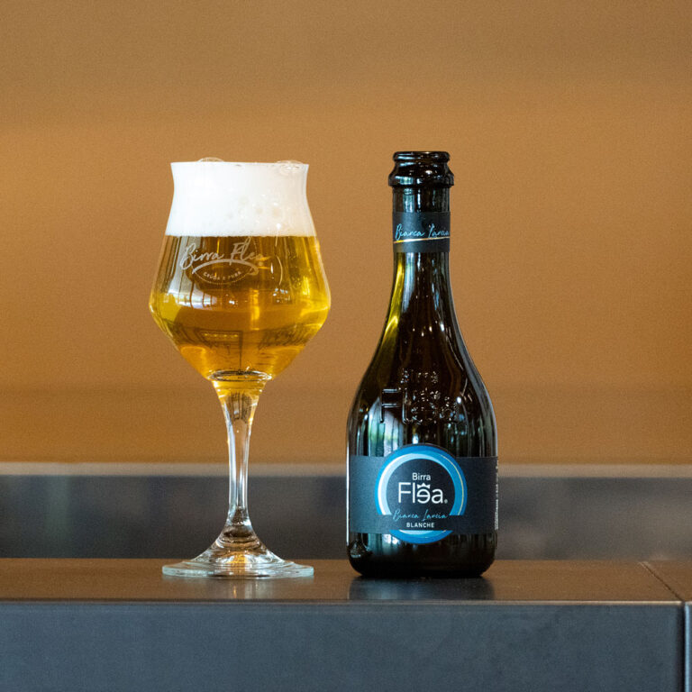
The first labels proposed by Susanna featured the classic image of Rocca Flea placed next to the figure who built it, Frederick II. It was a classic image that undoubtedly captured the historical significance and traditional craftsmanship that a craft beer must convey. Yet, as iconic as it was, the image still seemed to lack the universality that Matteo and Maria Cristina wanted to imprint on consumers’ minds. They needed an image suitable for any setting and audience but one that retained that regal elegance linked to the modernity of the current launch period. They therefore envisioned placing the Flea logo inside a circle that, when viewed from above, would let the imagination run wild, envisioning Flea in a glass of beer with plenty of fine foam on top. This was the perfect choice: a simple, modern, and light image, yet at the same time meaningful, suitable for the young, the not-so-young, the elegant, and the casual. Over time, it was enhanced with gold foil stamping (because we’ve always cared about the details). Choosing the bottle wasn’t easy either: we needed a container that would perfectly complement the young brand. A distinctive bottle that would reinforce the concept of regal elegance. The bottle we chose is the one we still use today—it has shaped the history of Birra Flea and witnessed the growth of our audience over the years. Despite the recent redesign of the label to keep up with the times, the bottle has remained unchanged, a symbol of affection from us and our many fans.
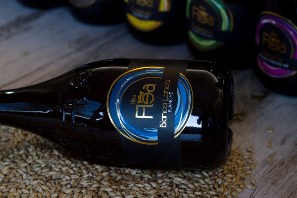
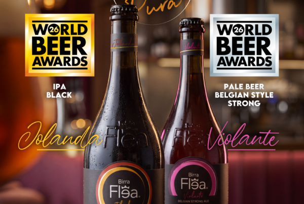
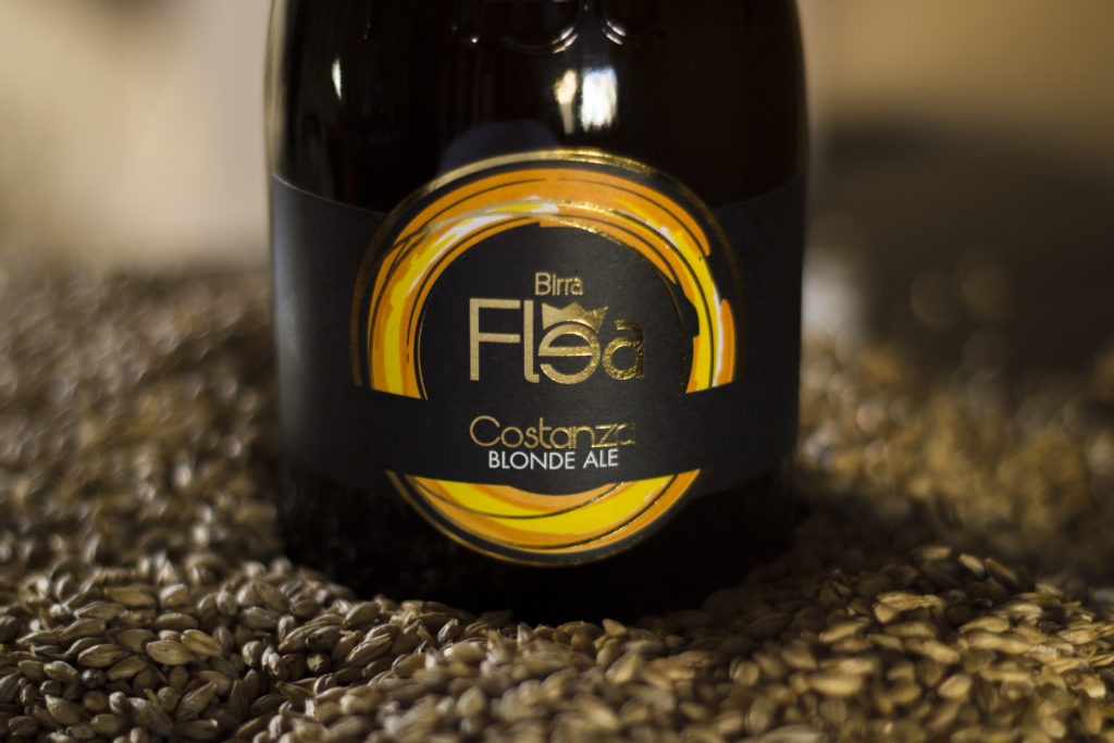
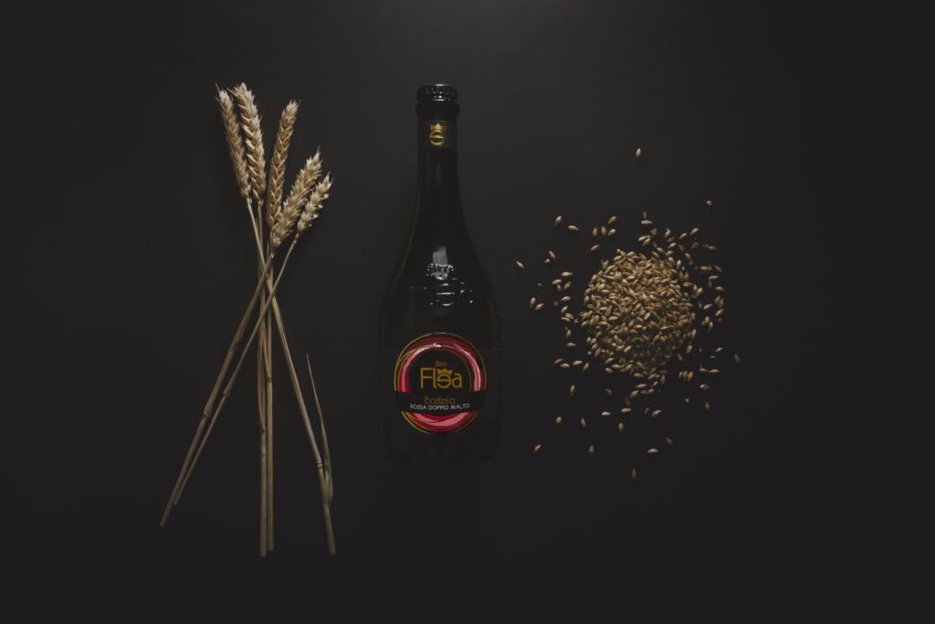
Intanto che lo storico ci forniva input e ricostruzioni della corte di Federico II, si ragionava sui colori per differenziare le varie referenze. E’ una parte fondamentale del marketing per avere riscontro emotivo da parte dei clienti, oltre che per soddisfazione estetica personale dei due imprenditori ‘genitori’ del progetto. Uscì fuori questa storia: Federico II, oltre che essere stato un valoroso condottiero, fu anche uomo dalle mille vite sentimentali, utilizzando uno stereotipo moderno un vero ‘latin lover’. Perché, insieme a lui, non dare vita anche alle sue numerose mogli, amanti e figlie?! Così, dai primi mesi del 2013, la birra aveva un suo nome, una sua immagine e quattro birre pronte da imbottigliare: una bionda classica con le vesti di Costanza d’Altavilla, madre dell’imperatore; una rossa doppio malto per la Bastola, colei che fu accusata di stregoneria e, si dice, diede fuoco all’antica Gualdo, un carattere forte per una birra tenace; una Golden Ale chiara tipo IPA che si aggiudicò Federico II, ed una birra bianca stile belga con nome Bianca Lancia, colei che rubò il cuore all’imperatore. Grazie al lavoro svolto dallo storico gualdese, ogni birra aveva un personaggio ed una storia che potete leggere sfogliando le pagine delle nostre birre sul sito.
All that was missing was a touch of color to make the whole design flow seamlessly and catch the eye; we know how important visual impact is in the marketplace, especially when you’re competing with many other established, high-quality alternatives. Once again, tradition came to our aid—more specifically, the folklore of our region. Many of those who follow us from afar may not know that in Gualdo Tadino, for over forty years, the patron saint, St. Michael the Archangel, has been celebrated with a three-day festival; we’ll quote these few lines from the book “Il Palio di San Michele Arcangelo, immagini e storia dei Giochi de le Porte di Gualdo Tadino,” which perfectly describe the scene:
“On the last weekend of September, to honor the patron saint, St. Michael the Archangel, the Giochi de le Porte take place—the most important, most well-attended, and most vibrant celebration in the town of Gualdo, where the residents spontaneously gave the town’s neighborhoods the general name of “Porte” and the specific names of Porta San Facondino, Porta San Donato, Porta San Martino, and Porta San Benedetto: this refers to the large gateways that opened in the city walls built by Frederick II, situated at the junctions of roads leading to the ancient churches erected in the immediate vicinity of the city.”
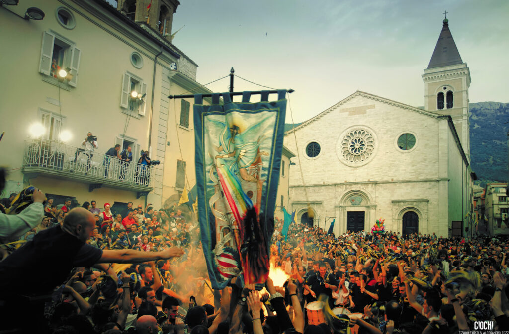
It is a deeply cherished festival featuring historical reenactments, medieval games, and donkey races. Yes, donkeys are the “workhorse” (pardon the oxymoron) of the festival. On the last weekend of September, Gualdo comes to a standstill, dons period costumes, pulsates to the beat of drums, and celebrates the winner of the Palio di San Michele Arcangelo by burning the effigy of the Bastola, a witch and a hag. Each of the four gates flies a banner in its tower in two colors: yellow-blue, yellow-red, yellow-white, and yellow-green. It wasn’t hard to discern the most important aspect of our festival: the colors of Gualdo’s beating heart. If you’d like to learn more about the Giochi de le Porte, click here: https://www.giochideleporte.it/
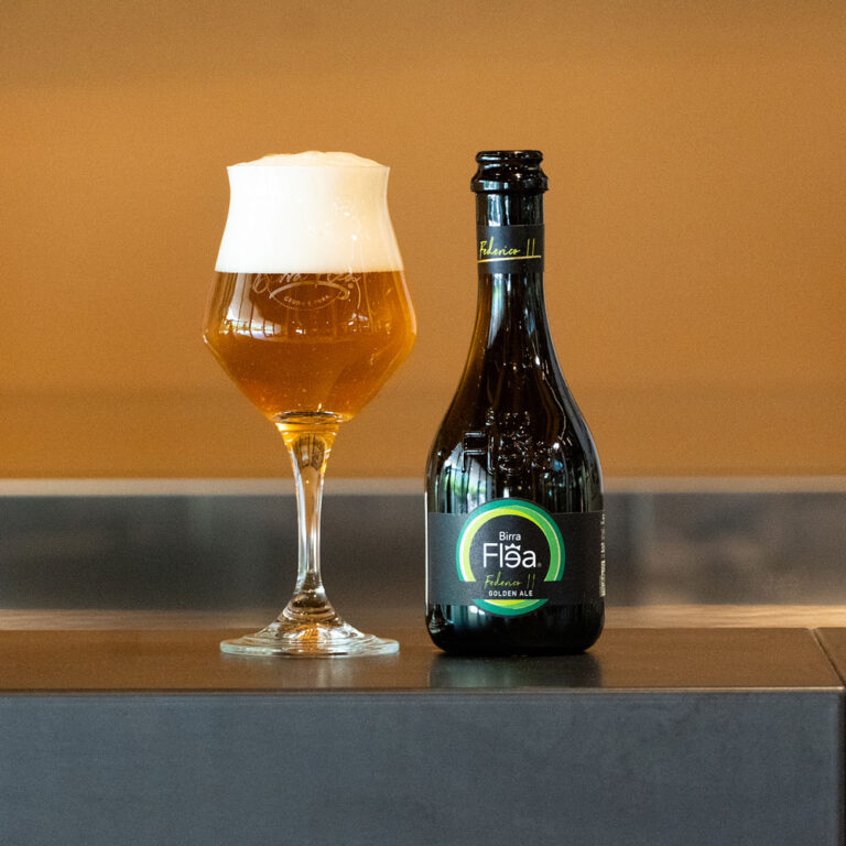
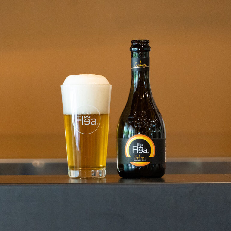
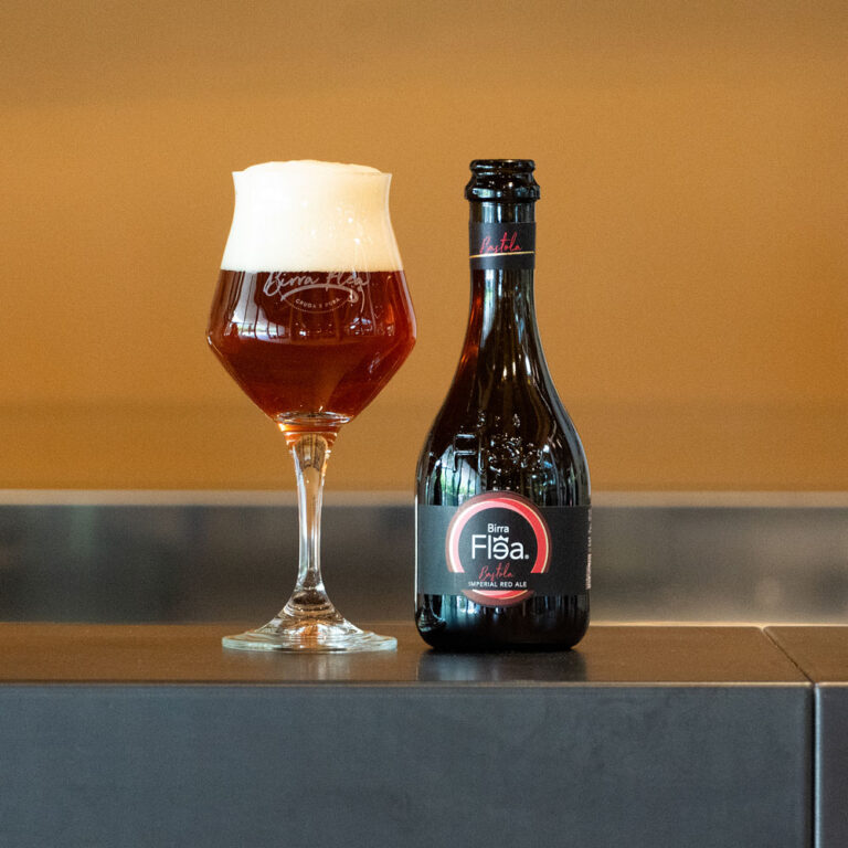
And so our first four beers took on their distinctive colors, drawn directly from tradition and our roots as gatekeepers: Costanza in shades of yellow and white, Federico Secondo in shades of yellow and green, Bastola in shades of yellow and red, and Bianca Lancia in blue.
But that’s not all. Once the technical aspects of the label were finalized, Matteo and Maria Cristina decided to give their beers a tangible, human face in order to appeal to consumers on an emotional level as well. They turned to the Rome-based graphic design and advertising agency Marimo, with whom they had built a long-standing partnership over the years, to create a bespoke photographic project of “legendary” quality; thanks to four models selected based on the physical, historical, and symbolic characteristics of their respective beers, the first four bottles now also had a face—what we respectfully call a “hero” today; The models are dressed in medieval garments crafted in Gualdo, used for the Games’ procession and created with meticulous attention to detail, historical accuracy, and precious fabrics by the renowned tailor Daniele Gelsi, himself a treasure of our Gualdo. The four faces have accompanied Birra Flea at trade shows, events, and in advertising materials. As time has passed and our product range has expanded, we have continued to give a face and a story to our beers, but this time drawing on the beauty of our local area…and we will continue to do so. We will delve deeper into the story of the Ladies and their portrayers in another article!

Photo credits: Michele Lucarelli – Birra Flea – Enrico Caputo – Il Fotone – Smartcomma – Games, colors, and the excitement of a community festival.
Dallo shop
Le birre di cui parliamo
Spedizione espressa gratuita da 69 € · Tutte le birre